Interviews Excerpt from “A Conversation with Kersten Geers and David Van Severen”
a+u: Looking through your projects, we noticed there seems to be an iterative process at work in your ideas, and in the ways you choose to represent them. For this interview, we were hoping you could share more about this process – the way you work and use your inspirations. You’ve mentioned Los Angeles a few times in lectures and in your own writing, and we noticed the [Reyner] Banham book, Los Angeles: The Architecture of Four Ecologies, on your shelf. To begin, how does this connection to LA’s pop culture, and generic American urbanism, fit in the beginning of your office?
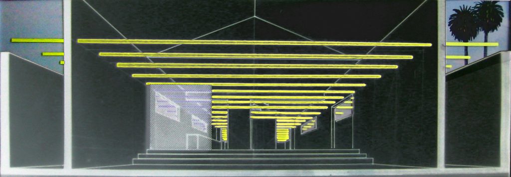
David Van Severen (DVS): We even say that our office somehow started in Los Angeles. It was there, while on a student trip, that we discovered we both had many interests, fascinations, and obsessions in common, and one of them was this American culture, the dream that we all have somehow in our minds. Our second project – by coincidence, actually – was in Los Angeles. We were sent by our Belgian client to Venice Beach to make a showroom, OFFICE 5: Showroom, for a furniture brand.
Kersten Geers (KG): I guess we have a bit of a European projection of a hypothetical LA which maybe didn’t really exist, but that’s no different from how [David] Hockney saw it, or Banham. It is a fascination for a strange, technicolor place. And, probably from that very beginning, an idea of scale, or scaleless-ness, or a certain fascination for hedonism, where sometimes you have a critical approach to it and sometimes you just completely embrace it. And ambiguity also, that of Hockney – maybe not at first – but with Hockney came [Ed] Ruscha and with Ruscha came a “do I celebrate or do I criticize?” kind of attitude. You know, the gas stations, the parking lots, the Sunset Strip, and all of this fit us both very well. From then on, our office has always been driven by an implicit agreement that when we both like something then it’s good – and it’s not exactly evident whether we like it for the same reason. At the same time, we are very interested in an almost direct experience of beauty, or to quote [John] Baldessari, a pure beauty. So, in a way, a lot of seeds were planted there.
DVS: Also important, I’d say, on the cover of this edition Los Angeles: The Architecture of Four Ecologies is this painting, of course, by Hockney, but it was also already brought to us in previous years by Abalos & Herreros in Madrid, where we both studied at one point. They were already, let’s say, planting other seeds. What we both obviously liked, what we maybe didn’t understand, is that in LA or the US, you have this Modernism, which was in some way freer than its European version, and that kind of freedom, lushness, hedonism as Kersten was saying – the extra layer – plus the sun, is what’s interesting to us.
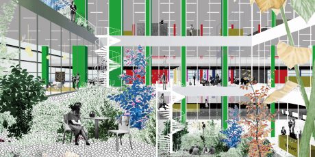
a+u: It’s curious. Your collages, and the fantasy they depict, perhaps could have been used as advertisements for homes in Los Angeles in the 60s and 70s. When did you start using them?
KG: The story we always tell – and, a story is always a story – is that we started making these collages from the very beginning, for the simple reason that we were unable to make renders. If you zoom out for a second and talk about it in a slightly different way, we were fascinated by Hockney, we were fascinated by Piero della Francesca; we were fascinated by these very composed images. I mean, an image not coming from a 3D model is, in a way, far more an object that describes your intentions. In the beginning, for the LA project we mentioned, it was a section and a collage and I think soon after, for OFFICE 9: Tower and Square, it was just white paper cut-outs depicting an idea of towers in Rotterdam.
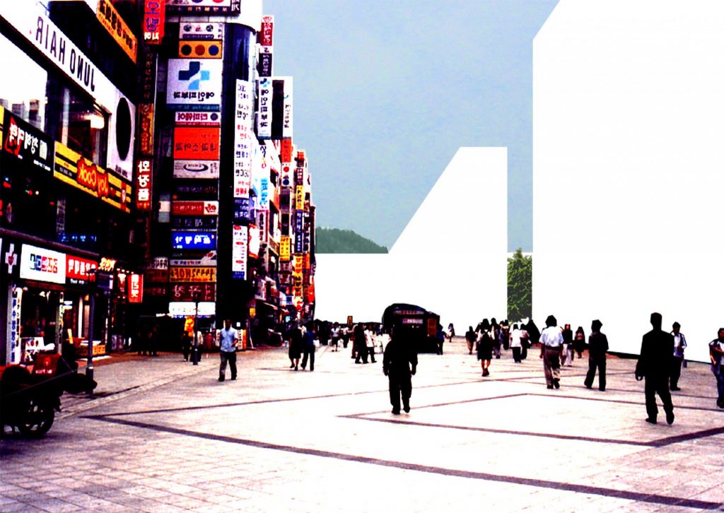
DVS: OFFICE 19: A Grammar for the City came afterwards, and we were much more aware of what we were doing. And here I remember we were talking about Baldessari, and his collages where he cuts out the meaning of the picture. In this case, the design is of course the white, and what is not designed is everything else. But also, Abalos & Herreros in the 90s, when we were their students, they were making these collages, too. Not like ours, theirs were very sketchy, very colorful. There were just copy machines, and it was really gluing pictures. It was just like, finding stuff – like objet trouvé – that you combined. And their collages really did that, and I think they were extremely powerful.
KG: I also remember them doing this. So did I as a student. And it was literally magazines, newspapers, cutting and gluing together. It was, in a way, very Dada. It was very close to their own philosophy; they would claim: “We do not invent anything in architecture.” They would just simply photocopy a facade of Jean Nouvel, glue it in, and add a roof of Sejima, for instance, and say, “This is it.” And then your mind starts to invent the project. So, after a couple of years, when we started working ourselves, we could somehow only do that. And we did it in a different way, influenced a little by Hockney, certainly. And it became something else.
a+u: Later in your careers, was it also a very Dada material exercise or was it mostly digital?
KG: We used Photoshop, but it was very simple, very basic. It’s also true that when we were doing this, it was so, in a way, radical – if I can use that word. It was so strange to do that, because everybody was making these transparent, wireframe drawings with lots of people in them. So, in a sense, it was also provocative. Of course, now it’s become the standard, every other practice does a kind of semi-collage aesthetic. Whereas, I think for us, what is still extremely important is that when you draw a line, it has intention, it has a meaning, and the same goes with these collages; if they become just echoes of good taste, they aren’t very interesting. And then sometimes it’s true that – we had this very recently – in competitions, it’s almost impossible to push the collage because, for some reason, people do not want to see the space in it.
DVS: That’s maybe the importance – what we always thought about the collages, and by coincidence understood by making them, was that there is a lot of space in them, and not just architectural space, but also a certain mental space. And we understood that if you make architecture, you need this space.
OFFICE Kersten Geers David Van Severen is a Brussels-based practice, established in 2002 by Kersten Geers (1975) and David Van Severen (1978). They both studied Architecture and Urbanism at the University of Ghent, Belgium and at the Esquela Técnica Superior de Arquitectura in Madrid, Spain. Kersten Geers has been teaching at various institutions, such as the Berlage Institute, Columbia University GSAPP, and Yale School of Architecture, and is holding a professorship at the EPF Lausanne and the Academy of Architecture in Mendrisio. He is a founding member of the architecture magazine San Rocco, and frequently publishes essays on architecture. David Van Severen had previously been teaching at the University of Ghent, École Nationale Supérieure d’Architecture in Versailles and the Berlage Institute. Since 1995 he has designed and made several objects, installations and furniture.
Kersten Geers and David Van Severen currently hold the Kenzo Tange chair at Harvard GSD. OFFICE Kersten Geers David Van Severen has received numerous honors and awards, including Belgian Prize for Architecture, Art Prize Berlin and the Silver Lion at the 12th Venice Biennial of Architecture. Since 2018, OFFICE is a partnership between Kersten Geers, David Van Severen and Jan Lenaerts.

